Rainbow Pizza Map
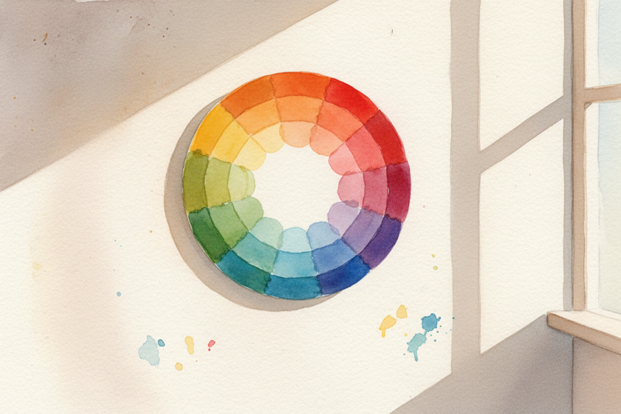
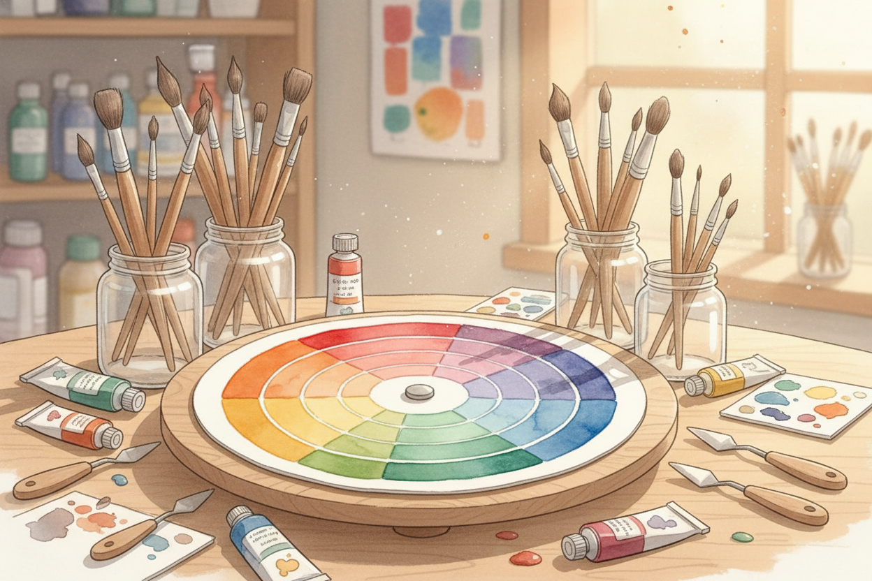
You've probably seen one pinned to an art room wall — a circle sliced into rainbow wedges like the world's most colorful pizza. It's called a color wheel, and artists treat it like a cheat sheet for making colors play nicely together. But why a wheel? Why not a list, or a grid, or a blob?
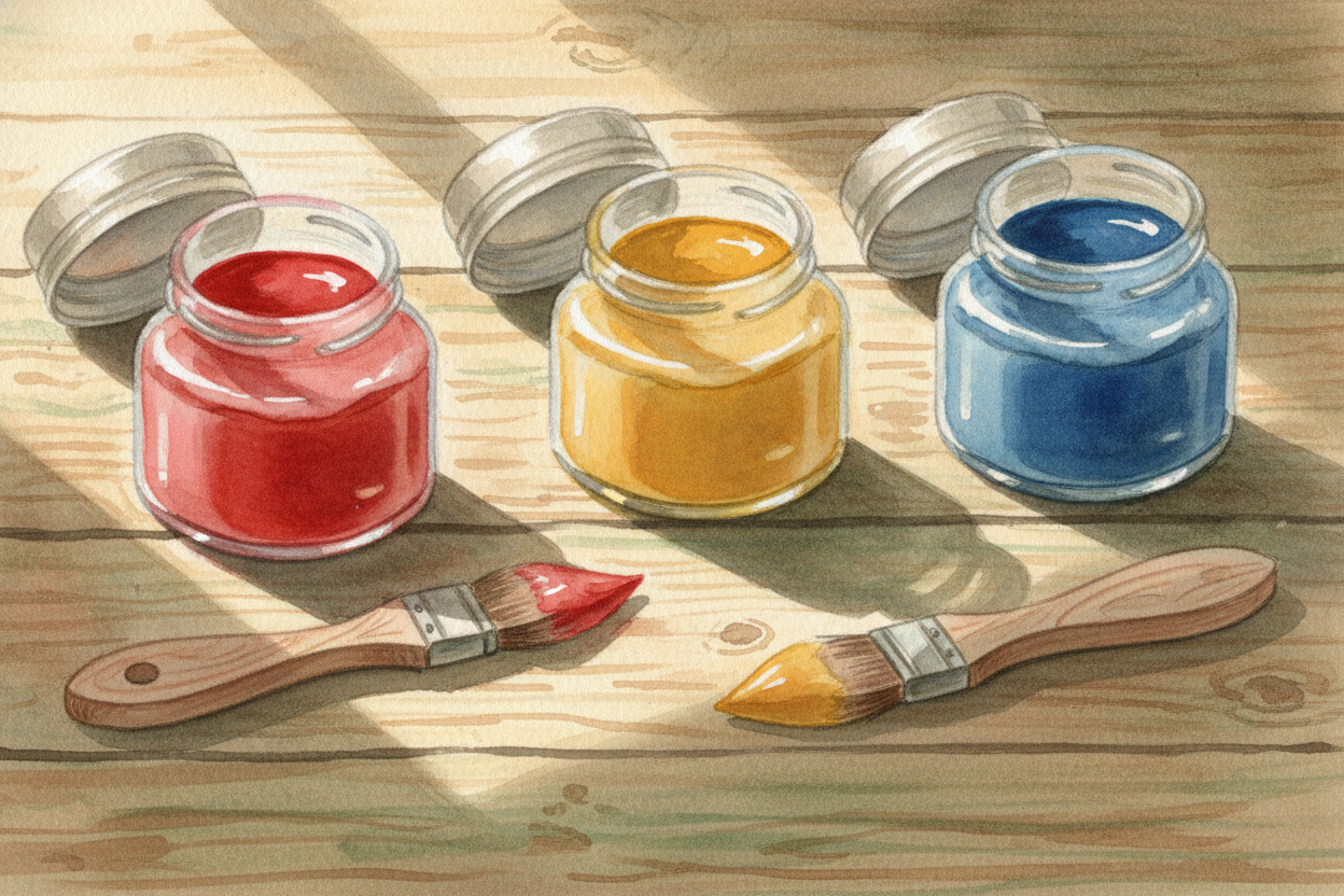
Start with the three colors you can't make by mixing: red, yellow, and blue. Artists call these the primary colors. They're the building blocks — like the flour, sugar, and butter of the color world. Everything else comes from them.
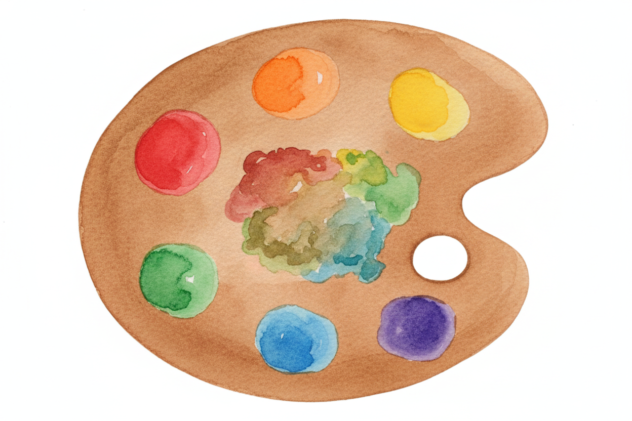
Mix any two primaries and you get a secondary color. Red plus yellow makes orange. Yellow plus blue makes green. Blue plus red makes purple. Now you've got six colors, and here's the trick: if you arrange them in a circle with each mixed color sitting between the two colors that made it, they line up in rainbow order.
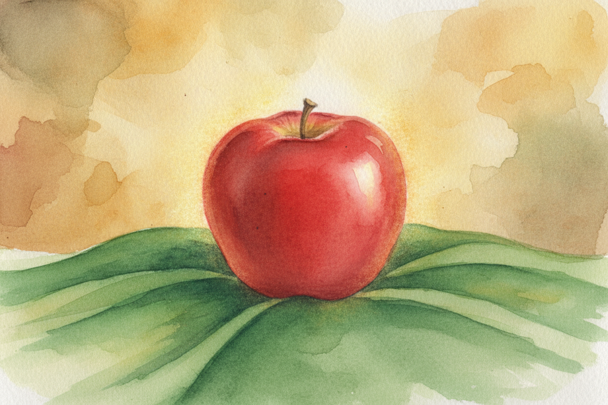
The wheel shape isn't just pretty. It's a map. Colors sitting opposite each other — like orange and blue, or red and green — are called complementary colors, and they make each other look electric when you put them side by side. A red apple looks redder on a green tablecloth. A yellow flower pops against a purple background. The wheel shows you which pairs will sizzle.
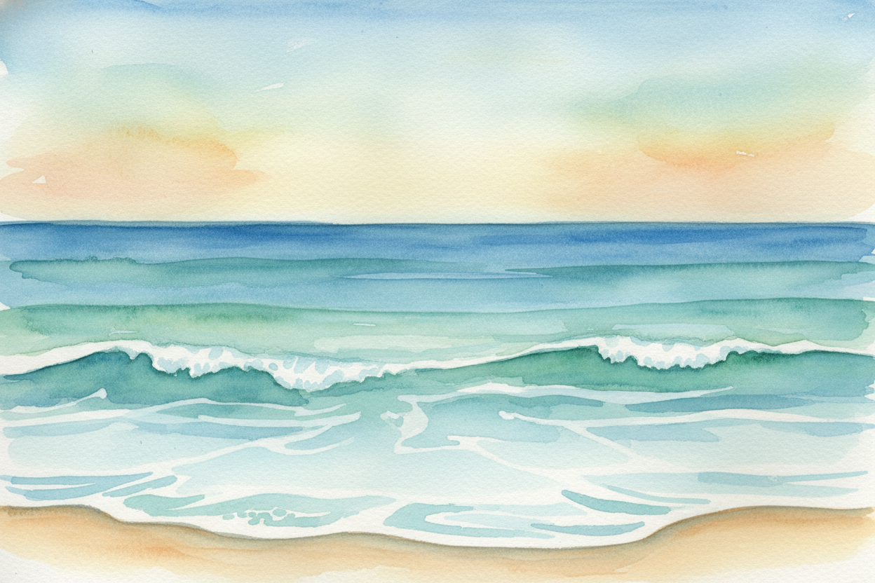
Colors sitting next to each other on the wheel — like blue, blue-green, and green — are called analogous colors, and they get along like best friends. They create harmony, a smooth feeling that doesn't fight for attention. Ocean paintings use them: all those blues and greens flowing together. The wheel tells you which neighbors will hum quietly in tune.
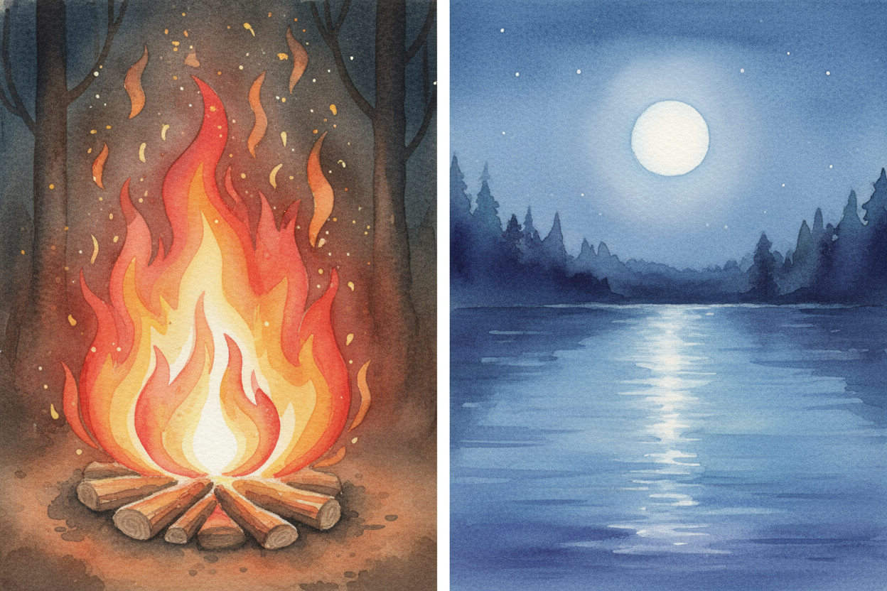
The wheel also tracks warm and cool. Draw a line from red-orange through red to red-purple — that's the warm side, the colors of fire and sunset. The opposite half — yellow-green through blue to blue-purple — is the cool side, the colors of water and shadow. Artists use this to create mood: warm colors feel cozy or exciting, cool colors feel calm or distant. One glance at the wheel and you know which side to grab.
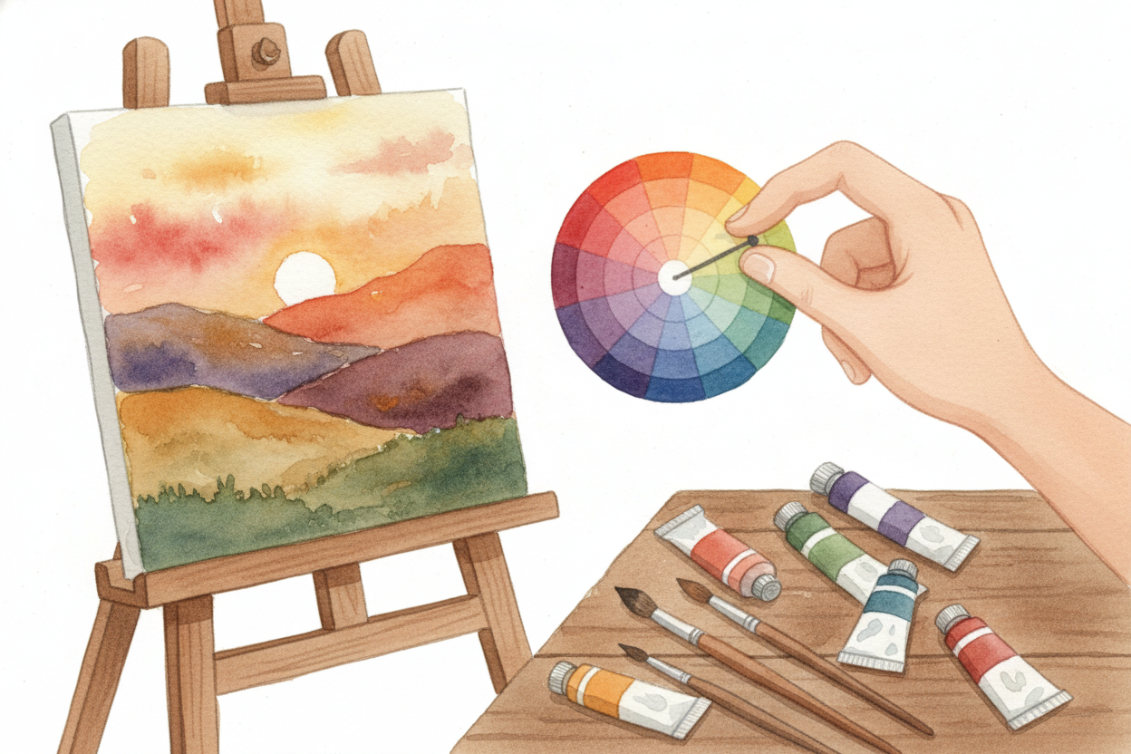
Every color has a personality, and the wheel keeps them organized so you don't have to remember it all in your head. Need a color that will make your painting feel balanced? Check what's across from your main color. Want a gentle gradient? Follow the wheel clockwise or counterclockwise. It's like having a color GPS.
So the color wheel isn't magic — it's just red, yellow, and blue holding hands in a circle, with all their mixed-up kids arranged between them. But that simple circle answers a thousand questions at once: Which colors go together? Which ones clash? Which ones whisper, which ones shout? Spin it, and you've got the whole rainbow at your fingertips, ready to play.