Color's Attention War

Stand in a crowded square and look around. A hundred different jackets, a thousand faces, signs everywhere — and yet your eyes snap straight to the flag rippling overhead. Why? What makes those bright blocks of color punch through all that visual noise?
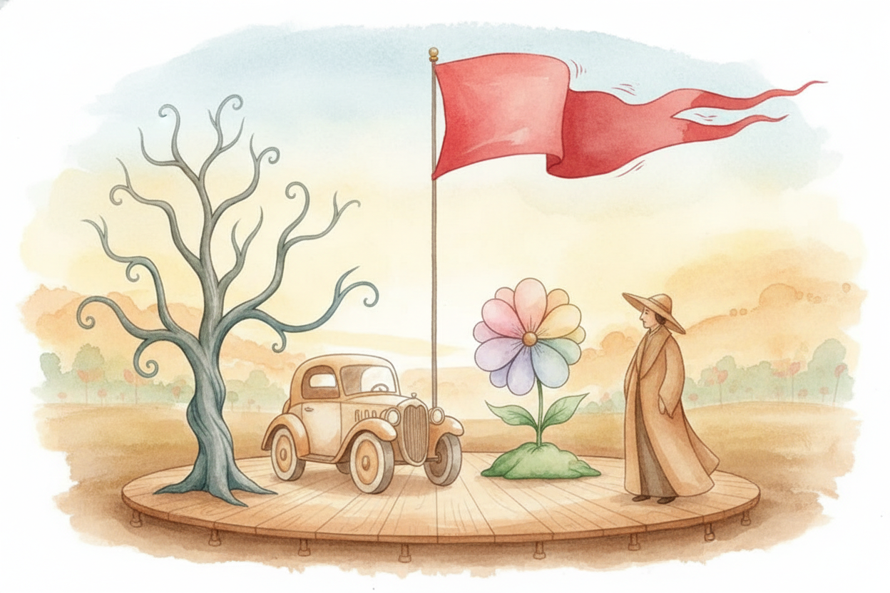
Your eye is a competition arena. Everything you look at is fighting for your attention — the tree, the car, the person walking by, the sky. Your brain can only focus on a few things at once, so it has to pick winners fast. Bold colors are the loudest contestants. They basically shout "LOOK AT ME!" while soft colors whisper.

Here's the trick: bold colors reflect a LOT of light. A fire-engine red flag bounces tons of red light straight into your eyeball. Your retina — the light-catching screen at the back of your eye — gets slammed with that signal and sends an urgent message to your brain: "Big red thing detected!" Your brain prioritizes urgent messages. A pale pink flag? The signal is so gentle your brain might ignore it completely while you're scanning for something important.

Now add CONTRAST — the difference between neighboring colors. A yellow stripe next to a blue stripe creates a sharp edge your brain can't miss. It's like drawing a line with a thick marker instead of a pencil. Flags use this on purpose: red-white-blue, green-yellow-black, orange-white-green. Each stripe makes its neighbor pop harder. Low-contrast colors (light blue next to medium blue) blur together from a distance. Your brain has to work to separate them, so it often doesn't bother.
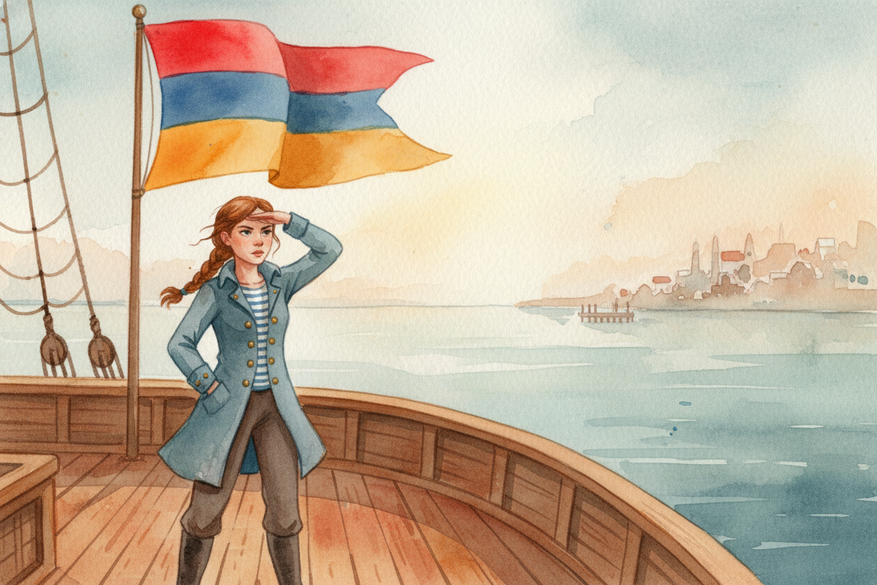
Distance is the other test. Imagine you're a sailor on a ship, squinting at the harbor a mile away. Subtle colors — sage green, dusty rose, soft lavender — wash out in all that air and haze. But a flag using PRIMARY COLORS (pure red, pure blue, pure yellow) cuts through. Primaries are the colors your eye's three types of cone cells detect most strongly. They're biologically optimized to be seen. That's not an accident — flags evolved to be spotted from far away, so they gravitated toward the colors our eyes are built to catch.
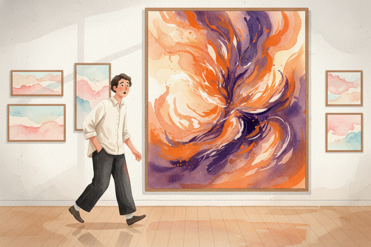
Art does the same thing, but for a different reason. A painter doesn't need you to spot the canvas from a mile away — they want to grab your EMOTION fast. Bold color is a shortcut to feeling. Walk into a gallery and see a painting drenched in electric orange and deep violet. Your brain doesn't think "orange and violet" — it FEELS energy, tension, heat. Soft colors make you pause and look closer; bold colors make you stop in your tracks. Artists use bold palettes when they want to hit you in the chest before you've even read the title card.

There's also a practical magic: bold colors SURVIVE. A flag that's been flying for months in the rain and sun will fade, but if it started bold, it stays readable. A painting in a dimly lit room or behind glass still communicates if the colors were strong to begin with. Designers and artists have learned over centuries that going bold is a kind of insurance — the message gets through even when conditions aren't perfect.
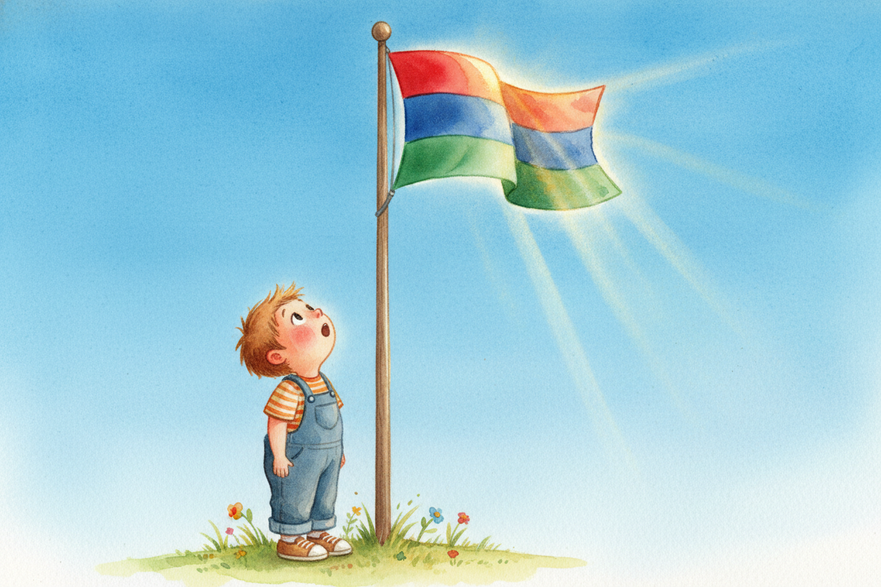
So when you see a flag snapping in the wind or a painting that stops you cold, you're watching a conversation between color and biology. Those bold hues aren't just loud for fun — they're engineered to win the attention war, trigger your feelings, and survive the journey from the artist's hand to your eye. Next time you spot one, you'll know: that color isn't just bright. It's WORKING.